Mobile-First Design: Why Your Website Must Prioritize Mobile Users
Over 60% of web traffic comes from mobile devices. Learn why mobile-first design is essential and how it impacts your SEO and conversion rates.

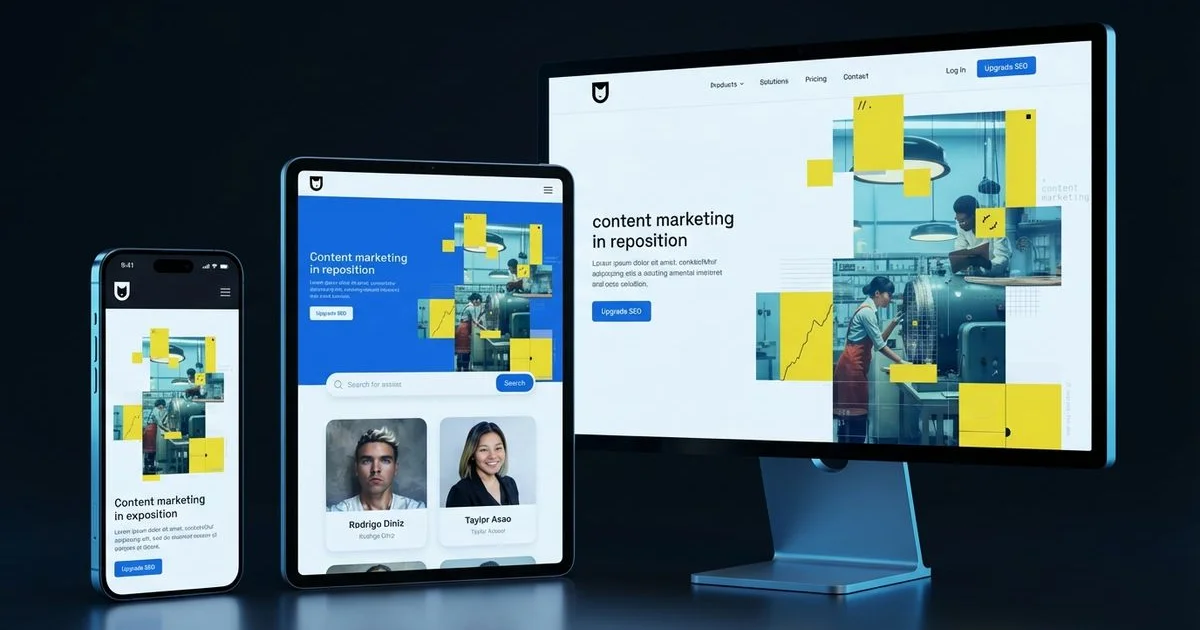
AEO Strategy Lead & Co-Founder
The Mobile-First Reality
You know exactly how it happens. A potential customer stands on a sidewalk in Kaka’ako or waits for a table in Haleiwa. They pull out their phone to find a service they need right now.
We see this scenario play out thousands of times a day across the islands.
The reality is that they aren’t going to wait until they get back to a desktop computer to look you up. If your site doesn’t load instantly and look perfect on that small screen, that customer goes to your competitor.
We have analyzed the data, and it paints a clear picture for local businesses.
More than 60% of all web traffic now comes from mobile devices. The intent behind these searches is immediate and urgent. When someone searches for “plumber near me” or “best poke downtown,” they are almost certainly holding their credit card or car keys. The question is no longer whether your website needs to work on mobile. It is whether your website is designed for mobile first and desktop second.
Mobile-first design is not just a best practice. It is a fundamental requirement for search visibility, user experience, and business growth in 2026. Our custom web design process starts with mobile-first principles to ensure every site we build performs at peak levels.
What Mobile-First Design Actually Means
Mobile-first design is a methodology where you start by designing for the smallest screen and then progressively enhance the experience for larger screens. This approach flips the old standard on its head.
We used to see designers create a complex desktop layout and then try to cram it onto a phone screen.
That outdated method is called “graceful degradation,” and it rarely works well. Mobile-first design uses “progressive enhancement.” You build the essential core of your site for the mobile user first. Then, you add features for tablets and desktops as screen real estate expands.
The Philosophy
When you design for mobile first, you are forced to prioritize. A smartphone screen gives you very little room to hide.
We find that this constraint is actually a blessing for clarity.
Every element must earn its place on the screen. This discipline produces cleaner, more focused designs that communicate your message effectively. When you eventually expand to desktop, you are adding enhancements to a solid foundation rather than trying to squeeze a bloated layout into a tiny box.
Mobile-First vs. Responsive
It is easy to confuse these two terms, but the distinction matters for your bottom line. Responsive design means your website code reacts to the screen size. Mobile-first is the strategy behind that code.
We break down the key differences in the table below:
| Feature | Mobile-First Design | Desktop-First (Responsive) |
|---|---|---|
| Starting Point | Content is prioritized for mobile users immediately. | Content is created for desktop and hidden/shrunk for mobile. |
| Performance | Faster load times because only essential assets load. | Slower load times due to hiding large assets via CSS. |
| User Intent | Focuses on immediate actions (Call, Map, Buy). | Focuses on immersion and complex layouts. |
| Maintenance | Easier to scale up to larger screens. | Difficult to scale down without breaking elements. |
All mobile-first websites are responsive. However, not all responsive websites are mobile-first. A site designed for a 27-inch monitor that shrinks down to a phone often feels cluttered and slow.
Google’s Mobile-First Indexing
Google now uses mobile-first indexing for all websites. This change fundamentally alters how your business appears in search results.
We need to be clear about what this means for your SEO strategy.
Google predominantly uses the mobile version of your website for indexing and ranking. Googlebot Smartphone crawls your site as if it were an iPhone or Android device. If your desktop site has great content but your mobile site hides it to save space, Google effectively does not see that content.
This makes mobile optimization a direct organic SEO ranking factor.
A site with poor mobile performance will lose rankings to competitors with better mobile experiences. This applies even if someone searches from a desktop computer.
For a complete overview of technical SEO factors including mobile optimization, see our technical SEO checklist.
Key Mobile UX Principles
Touch-Friendly Design
Mobile users interact with their fingers, not a precise mouse cursor. The accuracy of a tap is much lower than a click.
We apply strict “finger-friendly” standards to every interface we build.
- Tap Target Size: Buttons and links must be at least 44 by 44 pixels. This is the minimum touch target size recommended by Apple’s Human Interface Guidelines to ensure accuracy.
- Safe Spacing: Adequate spacing between targets prevents users from accidentally hitting “Cancel” when they meant to hit “Submit.”
- The Thumb Zone: Interactive elements should be placed within easy reach. Research shows that 49% of users hold their phone with one hand and use their thumb, meaning the top corners of the screen are hard to reach.
- No Hover States: Avoid hover-dependent interactions. There is no “hover” on a touchscreen, so vital information cannot be hidden behind a mouse-over effect.
Readable Typography
Text that looks elegant on a wide monitor can become illegible on a phone. Squinting users are frustrated users.
We prioritize readability metrics that work in bright Hawaiian sunlight and dim rooms alike.
- Base Font Size: Body text must be a minimum of 16 pixels. Anything smaller often causes iOS devices to automatically zoom in when a user taps a text box, which disrupts the layout.
- Heading Scale: Headings must be scaled down appropriately so they do not consume the entire viewport.
- Line Height: A line height of at least 1.5 ensures text doesn’t feel cramped.
- Contrast: High contrast between text and background is non-negotiable for accessibility and outdoor visibility.
Simplified Navigation
Desktop mega-menus with dozens of dropdowns do not translate well to mobile. They are cumbersome and often fly off the screen.
We recommend a streamlined approach for mobile menus.
- The Hamburger Menu: Consolidate navigation into a recognizable pattern like the hamburger icon (three horizontal lines) or a bottom navigation bar.
- Strict Hierarchy: Limit the menu to the top 5-7 most important pages.
- Physical Ease: Organize the list so it is easy to tap with one hand.
- Always-On CTA: Design a prominent call-to-action (like “Book Now” or “Call Us”) that remains accessible outside the menu.
Content Prioritization
On mobile, vertical real estate is your most precious resource. Attention spans are short.
We structure pages using the “inverted pyramid” style.
The most important content must appear first because many mobile users will not scroll to the bottom.
- Immediate Value: The primary value proposition must be visible without scrolling.
- Above the Fold CTA: A clear call-to-action should be instantly available.
- Front-Loaded Info: Essential details (hours, location, pricing) come before the backstory.
- Progressive Disclosure: Use accordions or collapsible sections for secondary content. This lets the user choose to see more detail without cluttering the initial view.
Core Web Vitals and Mobile Performance
Google’s Core Web Vitals metrics are the benchmarks for user experience. Crucially, these are measured based on mobile data, where processors are slower and connections are less stable.
We focus on three specific metrics that impact your ranking and user satisfaction.
Largest Contentful Paint (LCP)
LCP measures how long it takes for the main content of your page to load. On mobile devices with 4G or 5G connections, large images can kill your LCP score.
We target a load time of 2.5 seconds or less.
To achieve this, you must compress images specifically for mobile screens. Serving a 4MB desktop banner to a phone is a common mistake. Preload critical resources and delay non-essential scripts until the user actually needs them.
Interaction to Next Paint (INP)
INP measures responsiveness. It tracks how much time elapses between a user tapping a button and the screen actually changing.
We consider this the “frustration metric.”
Mobile devices have less processing power than laptops. If your site is running heavy JavaScript code in the background, the browser freezes. A good INP score is under 200 milliseconds. To fix this, minimize complex animations and defer heavy tasks so the main thread stays free for user input.
Cumulative Layout Shift (CLS)
Layout shifts occur when page elements move around unexpectedly while the page loads. This is infuriating on mobile, where a sudden shift can cause a user to tap the wrong link or ad.
We enforce strict dimensions on all media elements.
Always set explicit width and height attributes on images and videos. This reserves the space on the screen before the image loads. Avoid inserting dynamic content, like banners or newsletter signups, at the top of the page after the rest of the content has already appeared.
For detailed optimization guidance on each metric, read our dedicated Core Web Vitals guide.
Common Mobile Design Mistakes
Mistake 1: Unplayable or Auto-Playing Media
Large videos that auto-play consume expensive mobile data and slow down the phone. This is a quick way to annoy a visitor.
We advise making all video content user-initiated.
If you must use video backgrounds, compress them heavily and remove the audio track. Never auto-play video with sound on a mobile device.
Mistake 2: Intrusive Pop-Ups
Full-screen pop-ups (interstitials) are a nightmare on mobile. The “close” button is often tiny or hidden off-screen.
We strictly follow Google’s guidance on this.
Google explicitly penalizes sites that use intrusive interstitials on mobile because they block the user from the content they searched for. Use a subtle banner or a slide-in at the bottom of the screen instead.
Mistake 3: PDF Menus
This is a specific pain point for Hawaii restaurants. Uploading a PDF of your menu forces the user to download a file, pinch, and zoom just to see the price of an appetizer.
We convert all PDF menus into actual web text (HTML).
This allows the text to be readable without zooming. It also allows Google to index the individual dishes on your menu, which helps you show up in searches for specific food items.
Mistake 4: Horizontal Scrolling
Mobile pages should scroll vertically only. If a user has to scroll sideways to read a sentence, the layout is broken.
We test for “overflow” issues on every build.
This is usually caused by an image with a fixed width that is wider than the phone screen. Use CSS percentages or “max-width: 100%” to ensure elements stay within the viewport bounds.
Mistake 5: Ignoring Mobile Form Experience
Filling out forms on a phone is tedious. Tiny fields and the wrong keyboard layout cause high abandonment rates.
We optimize forms to reduce friction.
Use the correct input attributes. For example, setting the input type to “tel” brings up the numeric keypad for phone numbers, and “email” brings up the keyboard with the ”@” symbol. Keep forms short and ask only for what is absolutely necessary.
Testing Your Mobile Experience
Google’s Mobile-Friendly Test and Lighthouse
Google provides tools within the Chrome browser (Lighthouse) that evaluate your pages for usability.
We run these audits on every page template.
These tools give you a pass/fail grade and a list of specific technical issues to fix. It is the first step in diagnosing health issues on your site.
Real Device Testing
Emulators are helpful simulations, but they are not perfect. They cannot replicate the feeling of a slow network connection or the glare of the sun.
We test on actual hardware.
You need to see your site on an iPhone, a budget Android device, and a tablet. The experience on a 3-year-old Android phone often reveals performance bottlenecks that a new iPhone hides.
User Testing
Watch real people interact with your mobile site. Ask a friend or colleague to find a specific product or contact form on their phone.
We look for hesitation.
Where do they stop? Do they tap a non-clickable heading thinking it’s a button? Do they get stuck in the menu? Direct observation reveals UX flaws that automated code scanners will never find.
Mobile-first design is the standard for how websites must be built in 2026. By prioritizing the mobile experience from the start, you create websites that perform better in search, convert more visitors, and deliver a superior experience to the majority of your audience. Combined with strong conversion rate optimization and a solid technical SEO foundation, mobile-first design is a cornerstone of digital success.
Rodrigo Diniz
AEO Strategy Lead & GEO Specialist
AEO Strategy Lead at Nekko Digital with 15+ years in digital marketing and AI search optimization.